darrinhurst Posted June 17, 2009 Share Posted June 17, 2009 lol Not sure if it's a glitch in my computer or not. But it seems that this Forum of "General Chat - Not Fishing Related(NFR)" has a nice new look. You guys just testing it out, or should I stay off the acid? Quote Link to comment Share on other sites More sharing options...
Teck71 Posted June 17, 2009 Share Posted June 17, 2009 nope not a computer glitch I am seeing the same thing. looks good, I like Teck Quote Link to comment Share on other sites More sharing options...
theiceman2 Posted June 17, 2009 Share Posted June 17, 2009 I like it I think it might be time to retire to old "max logo". Any others agree? Quote Link to comment Share on other sites More sharing options...
beedhead Posted June 17, 2009 Share Posted June 17, 2009 nope not a computer glitch I am seeing the same thing. looks good, I like Teck Me too... Quote Link to comment Share on other sites More sharing options...
darrinhurst Posted June 17, 2009 Author Share Posted June 17, 2009 I like it I think it might be time to retire to old "max logo". Any others agree? Yes. Quote Link to comment Share on other sites More sharing options...
Teck71 Posted June 17, 2009 Share Posted June 17, 2009 I like it I think it might be time to retire to old "max logo". Any others agree? yes agree, Quote Link to comment Share on other sites More sharing options...
Hawgstoppah Posted June 17, 2009 Share Posted June 17, 2009 I would have bought a lot of FFC gear if that dumb logo wasnt on it. No offense to max. even if it was me posing for that logo I still dont like it one bit. Quote Link to comment Share on other sites More sharing options...
Teck71 Posted June 17, 2009 Share Posted June 17, 2009 maybe somthing like a trout framed in a landing net. Quote Link to comment Share on other sites More sharing options...
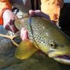
darrinhurst Posted June 17, 2009 Author Share Posted June 17, 2009 maybe somthing like a trout framed in a landing net. If you're gonna do something like that, I think Din's current avatar of his Brown would be a sweet pic to use as a logo. Quote Link to comment Share on other sites More sharing options...
SteveM Posted June 17, 2009 Share Posted June 17, 2009 I DON"T LIKE CHANGE!!! Seriously, I MUCH prefer the old look; this kinda looks...I dunno...not finished? Quote Link to comment Share on other sites More sharing options...
admin Posted June 17, 2009 Share Posted June 17, 2009 Thanks for the comments guys. Keep them coming. For those who don't like the "new" look, there is always the option of choosing the old skin. If you want to change to the new skin completely, scroll down to the bottom of the page and switch the dropdown menu beside the orange RSS button. The old one is called IPB default and the new is BMG_FORUMSET_09. I think we'll be making a change to the names though. Quote Link to comment Share on other sites More sharing options...
Teck71 Posted June 17, 2009 Share Posted June 17, 2009 sweet done Quote Link to comment Share on other sites More sharing options...
Tungsten Posted June 17, 2009 Share Posted June 17, 2009 Thanks for the comments guys. Keep them coming. For those who don't like the "new" look, there is always the option of choosing the old skin. If you want to change to the new skin completely, scroll down to the bottom of the page and switch the dropdown menu beside the orange RSS button. The old one is called IPB default and the new is BMG_FORUMSET_09. I think we'll be making a change to the names though. Whats the new logo,looks like a duck with weeds stuck to it. Quote Link to comment Share on other sites More sharing options...
rundleff Posted June 17, 2009 Share Posted June 17, 2009 Whats the new logo,looks like a duck with weeds stuck to it. We looking at the same page? You talking about the fly around the old logo? Gotta say I like the new look. Kicks Ass! Quote Link to comment Share on other sites More sharing options...
Smitty Posted June 17, 2009 Share Posted June 17, 2009 Anyone else having problems changing back to the old skin in Firefox? I keep trying to change it to the old one, the page tries to reload to no avail. Go to the forum index, change it there, it works - temporarily. As soon as I try to navigate through topics, it switches to the new look. Irritating to say the least. Logo is fine, though if you wanted to correct the "duck" impression, you might add the rest of the hook. As for the skin - I think it sucks. Black and white is bland, and I agree with the above it looks unfinished. The old "blue" hue made me think of water, and the blue was a cool, calming color. Thumbs down from me. Smitty Quote Link to comment Share on other sites More sharing options...
Tungsten Posted June 17, 2009 Share Posted June 17, 2009 We looking at the same page? You talking about the fly around the old logo? Gotta say I like the new look. Kicks Ass! Ha i think i might need glasses . Quote Link to comment Share on other sites More sharing options...
headscan Posted June 17, 2009 Share Posted June 17, 2009 Anyone else having problems changing back to the old skin in Firefox? I keep trying to change it to the old one, the page tries to reload to no avail. Go to the forum index, change it there, it works - temporarily. As soon as I try to navigate through topics, it switches to the new look. Irritating to say the least. Logo is fine, though if you wanted to correct the "duck" impression, you might add the rest of the hook. As for the skin - I think it sucks. Black and white is bland, and I agree with the above it looks unfinished. The old "blue" hue made me think of water, and the blue was a cool, calming color. Thumbs down from me. Smitty I'm guessing you have Firefox set up not to accept cookies. The setting is probably under Security or Privacy. Quote Link to comment Share on other sites More sharing options...
admin Posted June 17, 2009 Share Posted June 17, 2009 It's set up as a forced skin on the NFR board. If you visit this part of the site, you'll get the new shin for now. Once we make the full change, you'll be able to select the skin. I'm testing in IE / Chrome / Mozilla firefox and safari. If you notice any bugs, let me know. Quote Link to comment Share on other sites More sharing options...
KnotLikely Posted June 17, 2009 Share Posted June 17, 2009 I would have bought a lot of FFC gear if that dumb logo wasnt on it. No offense to max. even if it was me posing for that logo I still dont like it one bit. x2 Some of the best logo's are very simple i.e. Nike swoosh, VW, Macdonalds' golden arches, the Olympic Rings, Mercedes 3-pointed star, and of course the Playboy bunny. If you're looking at changing the logo, I'd suggest that it be clean and simple...also I'd imagine that it's a hell of a lot easier to embroider something like a Nike swoosh on a hat than that Max logo. Quote Link to comment Share on other sites More sharing options...
loyaleddie Posted June 17, 2009 Share Posted June 17, 2009 x2 Some of the best logo's are very simple i.e. Nike swoosh, VW, Macdonalds' golden arches, the Olympic Rings, Mercedes 3-pointed star, and of course the Playboy bunny. If you're looking at changing the logo, I'd suggest that it be clean and simple...also I'd imagine that it's a hell of a lot easier to embroider something like a Nike swoosh on a hat than that Max logo. This one has my vote! Quote Link to comment Share on other sites More sharing options...
Hawgstoppah Posted June 17, 2009 Share Posted June 17, 2009 The blue is way easier on the eyes than this. If it aint broken dont fix it. Take air canada's new crappy look as compared to the old clean one with red leaf on black tail. Your gonna mess something up that's good the way it is. cheers. Quote Link to comment Share on other sites More sharing options...
proflytyer Posted June 17, 2009 Share Posted June 17, 2009 The blue is way easier on the eyes than this. If it aint broken dont fix it. Take air canada's new crappy look as compared to the old clean one with red leaf on black tail. Your gonna mess something up that's good the way it is. cheers. i do like the new look but i think if there is nothing wrong with the old look then why should it change? Quote Link to comment Share on other sites More sharing options...
birchy Posted June 18, 2009 Share Posted June 18, 2009 You guys are missing the point.. It doesn't HAVE to change. They're just testing it right now. Once they know it works properly, you can CHOOSE to use the old one, or the new one. Nothing is being forced. Quote Link to comment Share on other sites More sharing options...
Din Posted June 18, 2009 Share Posted June 18, 2009 looks good. only thing I'd consider changing is the colors of the fish, it's hard to tell b/w the highlighted and non highlighted fish. keep up the good work and thanks for keeping this site up and running! Quote Link to comment Share on other sites More sharing options...
jksnijders Posted June 18, 2009 Share Posted June 18, 2009 Looks good to me. Quote Link to comment Share on other sites More sharing options...

Recommended Posts
Join the conversation
You can post now and register later. If you have an account, sign in now to post with your account.
Note: Your post will require moderator approval before it will be visible.